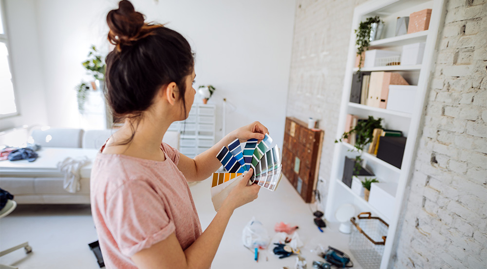
When you want to spruce up your home, a lick of paint can do wonders. But, with so many options out there, it can be hard to know where to start. Here’s our rundown of 2022 colour trends to get you started.
What’s new in 2022?
Over the last two years, our focus has shifted to creating nurturing, comforting, and calming spaces. But it’s not all about feeling calm, zen and in control. We are also looking for big, bold, refreshing change. And that is not at all surprising after long periods of lockdowns and uncertainty.
Pantone captured the mood perfectly with their pick for colour of the year, Veri Peri. They described it as embodying ‘the faithfulness and constancy of blue with the energy and excitement of red’.
In terms of home interior trends, we are seeing nature-inspired neutrals and splashes of big, bold colours. After a couple of turbulent years where many of us spent more time than usual staring at our interior walls, trends are pointing towards soothing tones to create a sanctuary and also deep, vibrant colours for new beginnings.
The New Neutrals
Neutral base colours have been reinvented this year. Hard, cold greys and neutrals are being put aside in favour of soft, warm neutrals that take inspiration from nature. Here are two of our favourites, Winter Terrace and School House White.
Winter Terrace – Dulux
This new take on a base neutral colour is warm with a subtle greenish undertone. It invokes a feeling of connectedness to nature. A versatile base colour, it sets the scene for a warm, welcoming atmosphere. Pair it with deep greens, warm greys and bright blues.
School House White No. 291- Farrow & Ball
This updated neutral is designed to look like white in a shaded area. It is muted, timeless and comforting. This choice will provide an adaptable background for dramatic embellishments like large scale artworks and statement rugs.
Nature Inspired
it is no surprise that we are seeking to reconnect with nature, having spent so much time connected to our devices over the past two years. This year, we see eucalyptus and olive-inspired greens, blues that remind us of vast skies, and ochre and clay browns on the menu. Olive Grove and Bright Skies sum up the mood perfectly for us.
Olive Grove – Porter’s Paints
This soft grey-green encourages a reconnection with nature and is easy to introduce into your home. It is a great foundation on which to build an earthy palette – match it with pale sky blues, a scorched earth red, chalky whites or deep fern greens.
Bright Skies – Dulux
This blue from Dulux is the embodiment of optimism and new beginnings. It is uplifting and light while being soothing and familiar, breathing new life into any space. Try it on your ceiling and watch it melt away into a perpetually blue sky.
Rich and Luxe
Bolder contrast colours reflect strength and optimism. They bring new life and energy into any space. Bright yellows, rich reds and deep blues are no longer limited to accent colours. Try them as wall colours in any space that needs refreshing. Here are three of our current favourites.
Vintage Gold – Dulux
Bring sunshine into your home with this joyful yellow. Babouche is cheerful and uncomplicated without feeling overpowering or garish. Try it on the walls or in a chequerboard pattern on the floor of a dark room paired with your favourite white.
Dragon’s Eye – Porter’s Paints
This sophisticated deep red creates a sense of warmth, luxury and drama. Use it as an accent colour in an alcove paired with pinks and creams or as a wall colour informal living areas to create a warm and welcoming atmosphere.
Excalibur – Wattyl
This moody blue-grey adds depth and character to any space, inside or out. Style it with some bright splashes of colour to create a sophisticated feel. Adding a few luxurious accessories further enhance the depth of this colour.
A new adventure awaits
No matter what your taste, one thing is certain – this year’s colours allow you to rewrite design rules. Your interiors can be layered, expressive and unapologetically individual. Combine moody hues with warm neutrals for a feeling of warmth. Or create a sophisticated feel with deep, dark blues paired with splashes of vintage gold. Add accents of colour where you may not have tried before, like inside an alcove or the underside of an archway.
It’s time for a new beginning – be daring. After all, you can always paint over it with 2023’s colours if it doesn’t work.